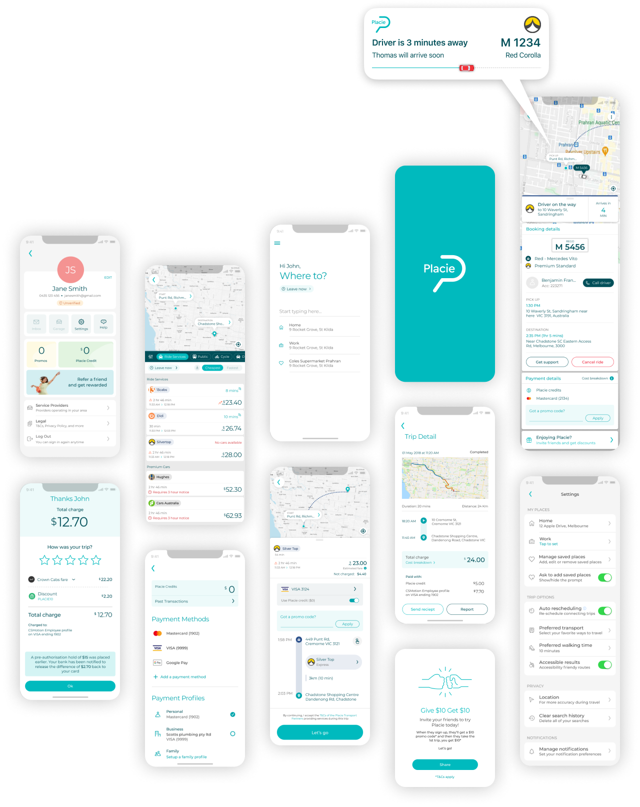
Placie: Compare & Book RIDES
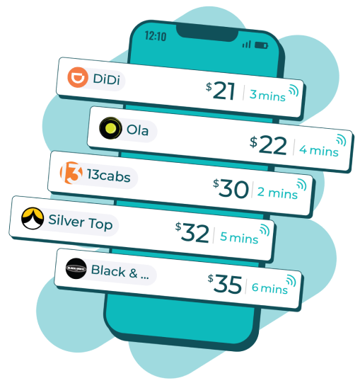
Rideshare, Taxi, Limos, Public Transport, Skybus and other modes of transport all in one app. Choose the cheapest or fastest way to travel
THE IDEA
Why install all those Rideshare and Taxi booking apps when you can have just one awesome app
Embarking on this journey to design and mature Placie over the years was an amazing and enjoyable experience.
From its inception to launch, I poured my heart and soul into creating the app and refining it until it reached success. Witnessing the app grow and evolve was truly fulfilling.
MY ROLE
Ideation to launch. Shaping the entire user experience and interface
I ensured that the design team maintained a cohesive vision and collaborated closely with stakeholders to ensure that the app met business goals while also prioritizing the user experience
Let me read your mind; Gain insights for a unique mobility solution

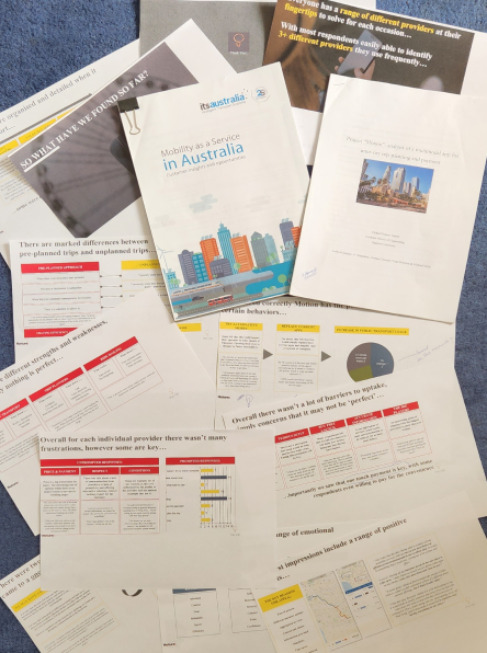
I managed the user research process to gain valuable insights into our target audience’s needs. Due to the scale of research required and our limited resources as a startup, we hired external research teams to conduct studies.
We engaged a group of researchers from Stanford University to write a report titled “Analysis of a multimodal app for intercity trip planning and payments“.
We worked with Nature, a Melbourne-based company, to conduct research on user preferences for transportation booking and payment apps.
We also commissioned a report on Mobility as a Service in Australia from ITS Australia, which provided valuable insights into the mobility landscape in the country.
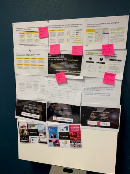
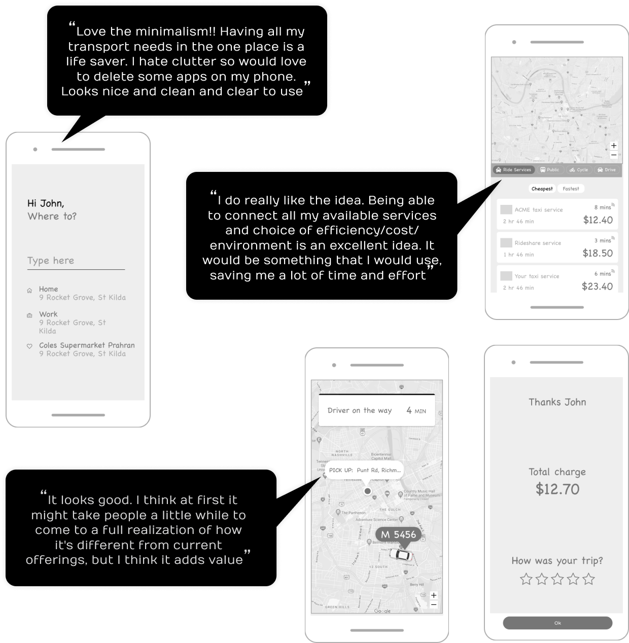
GATHERING FEEDBACK
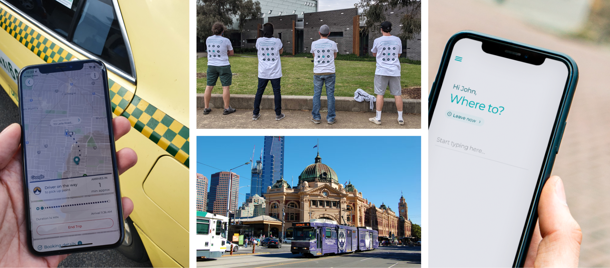
Taking to the streets with early concept designs
SIMPLICITY
So easy my grandma could use it.
COMPARISON & CONTROL
Able to compare transport options all in one spot and have more control over decisions
TRANSPARENCY
Pricing clearly displayed. Information has to be easily digestible and presented
CONVENIENCE OF PAYMENTS
Allowing payments for any transport to be made through one app
DESIGN APPROACH
Design the perfect app for everyone, everywhere
To shape my design approach, I focused on three key questions:
- How can a design be inclusive for all users, regardless of location or background?
- Which contextual factors are important to consider when designing this app?
- How can the Rider and Driver experience be influenced by various factors?
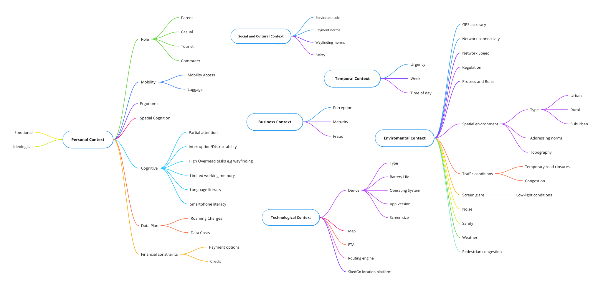
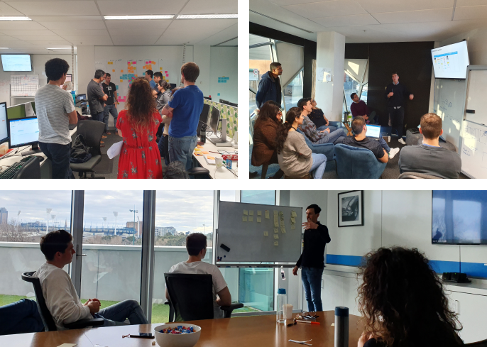
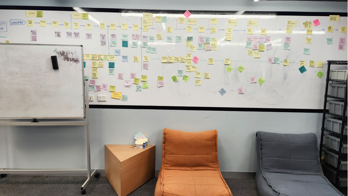
From the outset, it was crucial to gain a deep understanding of these factors, which led me to map out a range of potential design concepts. To translate these concepts into a practical framework, I developed a distributed mind-map approach that accounts for various situations and scenarios.

Navigating the Minds; Crafting Personas, Flows, and Architecture
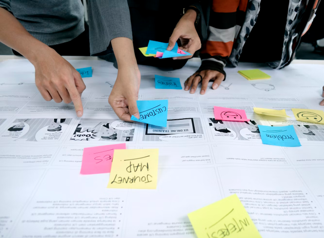
With the personas in place, I then worked on creating user flows that outlined the various steps involved in using the app. By mapping out these flows, we were able to identify potential pain points and make adjustments to the app’s design to streamline the user experience.
Finally, I developed the app’s information architecture, organizing the app’s content and features in a way that made sense for our users. This involved creating a clear and concise menu structure and grouping related features together.
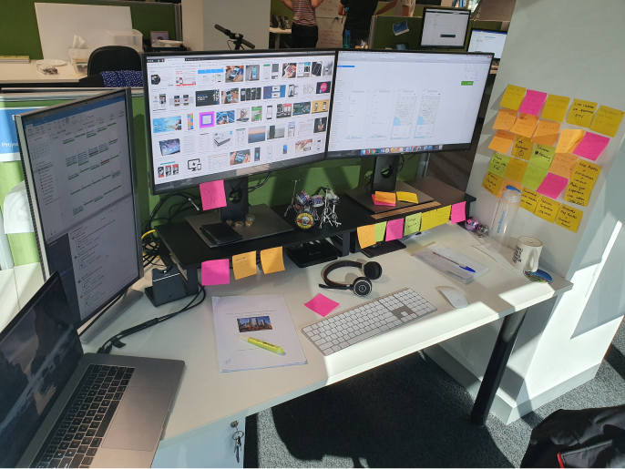
Wiring up the app. Lets put it all together
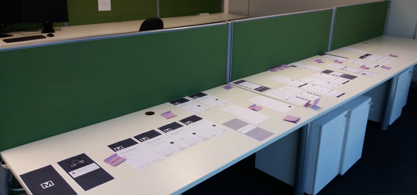
PROTOTYPES
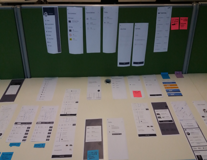
From scribbles to pixels, one prototype at a time!
Putting the app to test – No pressure, just pure adrenaline!
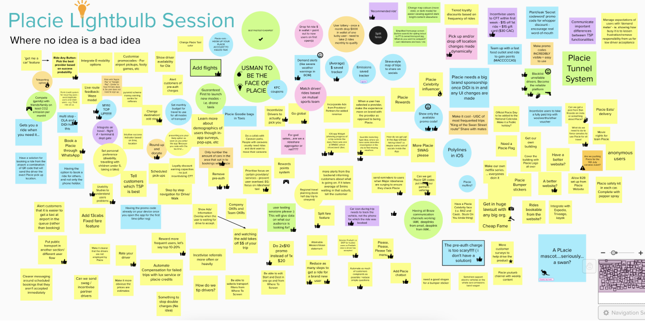
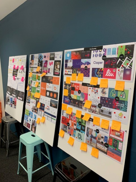
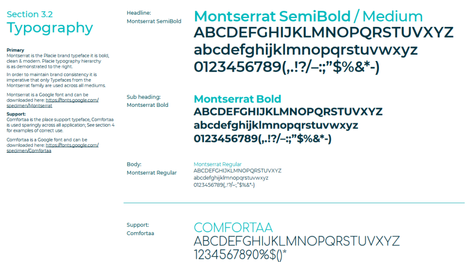
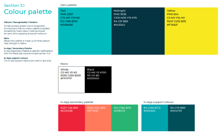
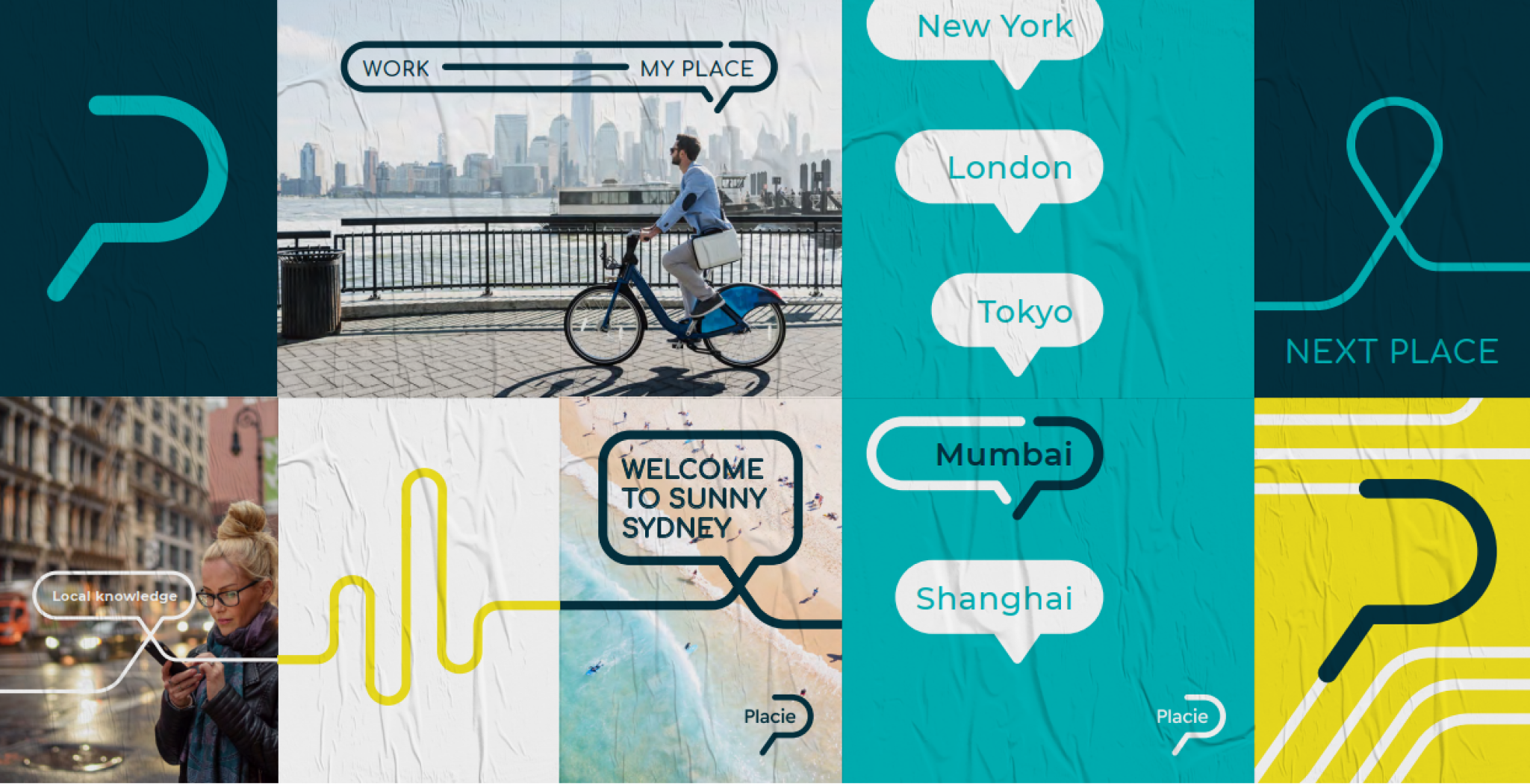
BRAND IDENTITY
A star is born. CSMOTION becomes PLACIE
From the initial brainstorming sessions to the final design elements, it was a collaborative effort. The end result was a brand identity that truly captured the essence of Placie’s mission and values.
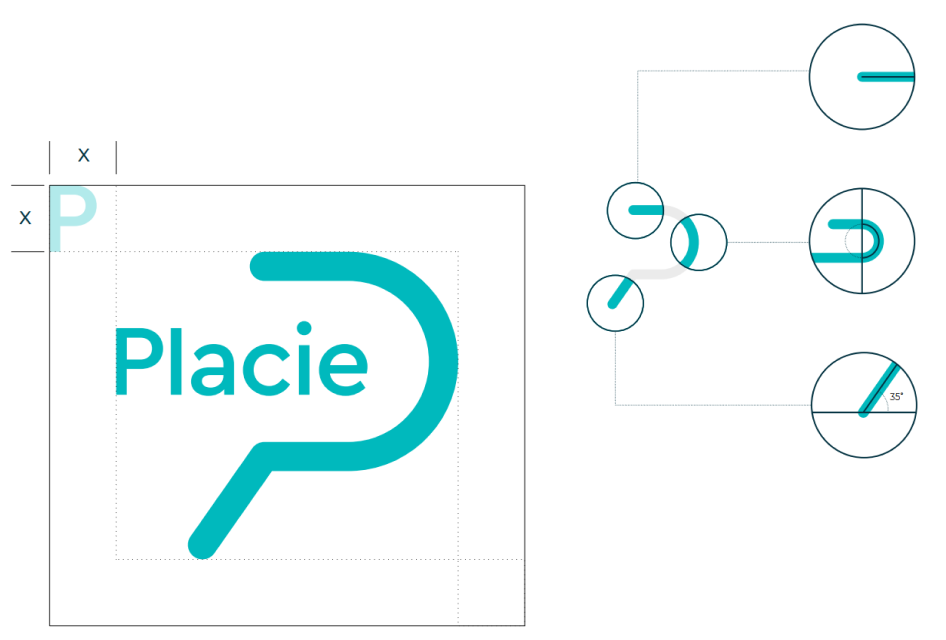
VISUAL DESIGN
From vision to visuals, Bringing the app to life
There were multiple design iterations, and we worked closely with the the devs and marketing peeps to ensure the branding and design language were consistent and on point.
